A Visual Update
Website Navigation Project
The existing website navigation was not effectively supporting either user needs or core business goals. I identified an opportunity to create a navigation system that was both more visually impactful and significantly more usable, and I initiated the project to address these gaps.
I led the end-to-end design effort, partnering closely with designers, engineers, product stakeholders, and leadership. In addition to setting the overall direction, I provided art direction and visual standards while mentoring and guiding an internal designer throughout the project.
My Role
I initiated the project, defined the vision, and led the design team through exploration and execution. I partnered closely with development, product, and leadership to align on goals and constraints, while providing hands-on art direction and visual standards. I also led and mentored an internal designer, ensuring consistency, quality, and clarity across the final solution.
Impact
The redesigned navigation improved discoverability of key actions, elevated high-intent pathways, and better aligned the information architecture with both user expectations and business priorities. By simplifying the structure and surfacing critical content above the fold, the navigation became clearer, more scannable, and more conversion-focused—creating a stronger foundation for future growth and iteration.


Prior Navigation
-
Excessive Height and Lost Visibility
Subtext beneath top-level navigation items significantly increased the height of the navigation, often pushing key content below the fold. As a result, critical calls to action were not immediately visible to users. -
Hidden Primary CTAs
Important actions, such as contacting sales or starting a free trial, were placed below the fold, making them inaccessible to nearly 40% of users without scrolling. -
Ineffective Promotional Space
The promotional area within the navigation directed users to a general overview page rather than high-intent, conversion-driven destinations like Contact Sales or Start a Free Trial. -
Missed Opportunity with Pricing
“Pricing” was the only primary navigation item that did not use a dropdown, despite the company’s transparent pricing model being a key competitive differentiator. This limited visibility into plan options and underutilized a high-interest entry point for users.


User Research
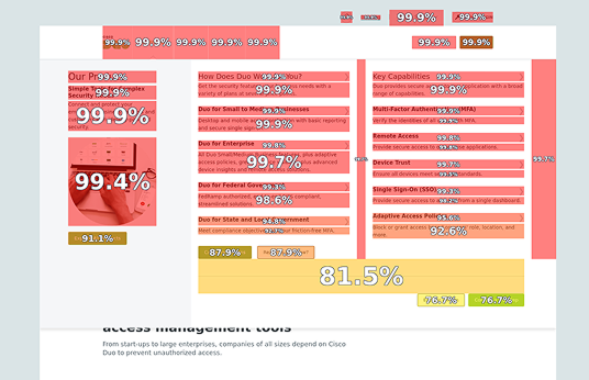
To better understand how users interacted with the navigation, I analyzed behavioral data using Content Square. These insights directly informed the design strategy and helped prioritize changes that would have the greatest impact.
Key Findings:
-
Users were dropping off toward the bottom of long dropdown menus, indicating that important links were being missed.
-
Primary calls to action were hidden below the fold and frequently overlooked.
-
Promotional content on the left side of the navigation was highly visible and received strong engagement.
-
Users repeatedly clicked on descriptive subtext beneath navigation items, even though those descriptions were not linked, leading to confusion and frustration.
These findings reinforced the need to simplify the structure, reduce cognitive load, and make key actions immediately visible.
Design Process
The team began by reviewing navigation patterns and best practices across the industry to understand how similar products solved for scale, clarity, and conversion. We explored multiple navigation concepts and iterated quickly, refining the structure and visual hierarchy with each round.
Throughout the process, we gathered feedback from our internal design team and partnered closely with development to ensure concepts were technically feasible and scalable. Once refined, I presented the final direction to leadership and secured approval to move forward with implementation.


New Navigation
The redesigned navigation focused on visibility, clarity, and intentional use of brand expression.
Key Improvements:
-
Removed subtext and introduced a two-column layout, ensuring all navigation options were visible above the fold.
-
Retained the left-hand promotional space, but reworked it to better reflect brand personality and direct users to high-intent, lead-driving pages.
-
Introduced icons to guide attention to priority pages while adding warmth and visual interest.
-
Reduced the number of CTAs and removed redundancy to focus users on the most important actions.
-
Added package pricing, pricing icons, and direct links to individual plan pages—fully leveraging pricing as a key differentiator.
